Planes, Trains, and Automobiles
Back in Chicago, my apartment in Uptown offers a unique vantage point on the city’s constant motion. From my window, I can see the hustle of Sheridan Road, the vastness of Lake Michigan, and the steady stream of planes on their final approach to O’Hare. I often found myself jumping between Flightradar24, MarineTraffic, and Google Maps, trying to piece together a complete picture of the traffic around me. I decided to build a single dashboard to see it all at once.
The Plan: Sourcing the Data
My goal was to combine data from multiple sources onto a single satellite map. I found that the Chicago Transit Authority (CTA) offered a free API for their train data, which was a great start. For planes and boats, I planned to use APIs from Flightradar24 and MarineTraffic.
I used Google Colab notebooks to work with the APIs. This was a huge help, as I’ve always found the syntax and structure of API requests to be a bit of a pain point. Using Gemini within Colab supercharged my ability to parse the data and quickly understand its structure.
The Real Problem: Plotting the Data
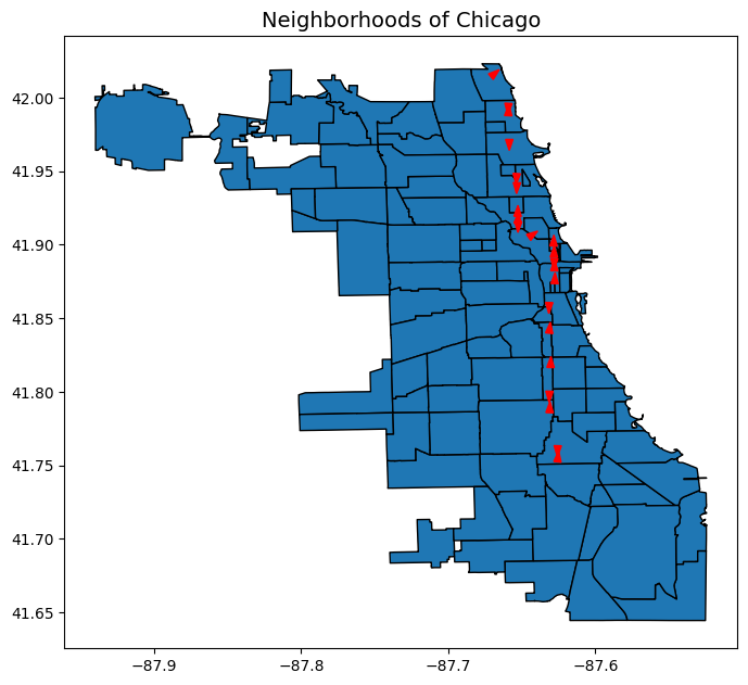
Once I had the CTA data, I ran into a new problem: how to plot it on a map? I spent several days exploring different options. I started with GeoPandas, a library I was familiar with, and a shapefile of Chicago’s neighborhoods.
This worked, but it wasn’t ideal. Shapefiles are powerful, but they felt like overkill for this project. I needed a more dynamic mapping solution. After a bit more research, I discovered Folium, a Python library that makes it easy to create interactive maps. It was the perfect tool for the job.
A Lesson in Data Amalgamation
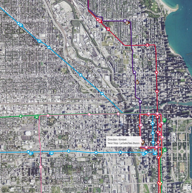
Working with Folium was a breakthrough. I could finally plot the train locations on a proper satellite map. I then decided to add the train routes and station locations to provide more context. This is when the true nature of the project revealed itself. I wasn’t just building a plotting app; I was building a data amalgamation app. The train locations, routes, stations, and the map itself all came from different sources. I was fetching, receiving, and combining all this information into a single, cohesive view.
Building the Prototype
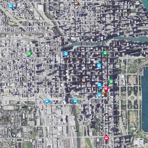
After a lot of debugging (especially with the custom icons), I had a working prototype. Hovering over a station reveals its information, and the trains are plotted in their correct locations.

One of the biggest challenges was getting the custom icons to display correctly. After trying several approaches—offsetting, redrawing, and scaling—I was still stuck. I turned to Gemini for help, and after some back-and-forth, it suggested a different set of parameters for the offset approach that finally worked. This is where I found AI tools to be most helpful: not as a replacement for my own problem-solving, but as a partner to help me get unstuck and explore different solutions.
The Roadblock: Planes and Boats
With the CTA portion working well, I moved on to planes and boats, but this is where I hit a wall. It turns out that real-time data, especially for flights and marine traffic, is hard to come by for free. The free APIs I found only provided status updates (‘active’, ‘landed’, etc.), not real-time location data. To get the live data I wanted, I would have needed a paid subscription or my own ADS-B receiver, and I was determined to keep this a software-only project. With that, I had to scrap the plane and boat tracking portion of the project.
Conclusion
Below is a live-ish display of the CTA trains. The map is generated by a Python script that fetches data from the CTA’s API and plots it on a Folium map. The map is then saved as an HTML file and displayed here.
If I were to develop this further, the first step would be to incorporate more real-time data and find a way to display it dynamically, rather than as a static snapshot. But for now, it’s a satisfying solution to my original problem, and a great learning experience in the world of APIs, data visualization, and the power of AI-assisted coding.
Follow-up
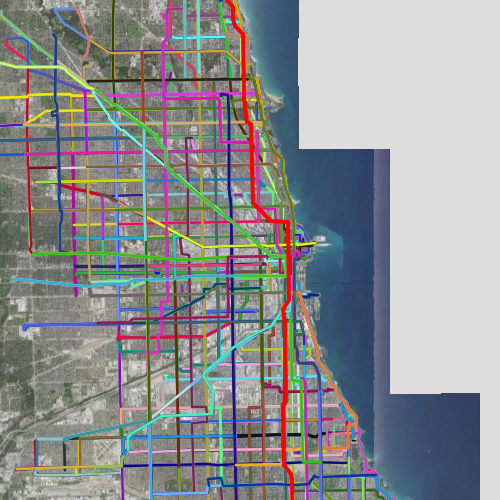
I wrote a script to display historical data. Here is the morning rush 3:30am-10:30am4:30am, when the trains’ schedules start. Red and Blue lines run 24 hours.
*filesize limit